Chile Chapters
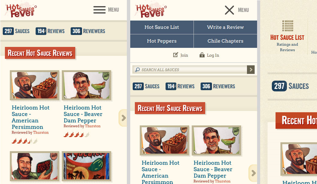
Improved Layout on Mobile Phones and Tablets
We've rolled out some new updates to the layout and interface of the website for smaller screens. The main menu has been condensed to a more standard expanding "hamburger" menu, and much of the spacing and sizes have been adjusted to fit more on the screen and reduce the amount of scrolling necessary to view the content.
More responsive updates will be rolled out over the next few weeks, to improve some more details. The individual sauce pages need a little bit of love. When we originally created this site, responsive design was just becoming commonplace, and a lot has changed and been learned since then. If you notice any major display or usability problems, please email us or leave a comment here with your device and browser info.
The home page has also been changed to add a list of the latest sauces that have been added.
More Improvements on the Way
This is the start to a series of improvements. Next will be making the site a little more app-like, with an easy way to add to your home screen. This way you can use the site like an app to review hot sauces and keep track of the one's you've tried.